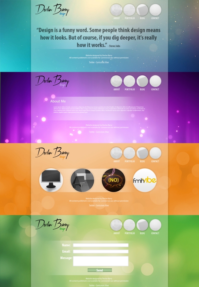
Ever since I produced my original portfolio website I have looked to modify the page as I feel it wasn’t eyecatching enough. In order to fix this I looked at the background however with the multiple colours it was difficult to implement a design. I spent a while playing with designs that make the page looks clean but interesting enough to attract potential employers. While initially I was going to go with the one primary colour as suggested by my tutors upon revision I felt this looked quite standard. However as I am promoting myself and my creativity I want to push the boundaries as this will show that I produce unique designs with practicality as well as aesthetics.
I believe what I created originally was a good base to start from. I was pleased with my initial design however as my tutors pointed out it was too central and could do with variation. This along with my background were my primary concern as I felt these were the first impressions of the site. Overall I am happy with the usability of the site and I just want to change the looks to make it more visually appealing.
I started by looking at the positioning of the logo and the navigation. My aim with these were to make them less focused centrally in order to make the focus the content of that page. I also replaced the text on my website with my new logo. This was a significant improvement in my opinion as it made the page look more personal and less standard. I decided upon the placement of my logo in the top left as to ensure this is the first thing the user sees on the website so they know my name and can associate my work with it. I then decided to use my nav on the opposite side so that I can give more space to the content and the nav is the natural progression from the logo to view. As with my current navigation I have kept the logos but changed the shape to circles as this is a personal preference that I prefer over squares that gives character to the page. The navigation will be white with my images laid over them as per my previous design but the colours will appear on the hover over.
The colours relating to the section was something that I looked upon improving. I wasn’t very happy with how they were represented before as I believe the lack of gradients and depth made them feel unpolished. However I combined the background issue with this one to come up with the idea that each page would have a separate background relating to their colour. When I tried this out I found backgrounds had to be done exactly right not to clash with the text or make the text unreadable. This took a lot of trial and error in order to ensure that the background fitted my website perfectly and the ones I chosen did this.
However, with the lack of a navigation on the homepage I wanted to find something that represented me and my ideas. I looked at several different designer websites and a few had quotes or introductions that represented them. I liked the quote idea and this reminded me of a Steve Jobs quote “Design is a funny word. Some people think design means how it looks. But of course, if you dig deeper, it’s really how it works”. I feel this is a suitable quote that sums up my ideas about design well.
Overall I am very pleased with my designs. I feel it is a lot more eyecatching meaning there is a higher chance it will stand out amongst a sea of designers. I wanted it to incoperate my design ideologies and my personality instead of being standard and I feel my design now does this. As for the coding aspect it seems very achievable with my coding knowledge so I am happy with my level of design being realistic as well as in my opinion good looking.

