0

Summary of the last two weeks

Over the last two weeks I have been doing a series of self initiated mini-projects. All these can be seen on previous blog entries with my thought processes and critique.


My aims for the two weeks were to try new designs and programs that I have previously not tried out. I am very happy with this decision as it meant I can learn some new skills such as Adobe Illustrator, Low Polygon modelling and Photo Editing. I mentioned before the 2 weeks started that rationing my time would be crucial to this and  I feel like I could have done more if I did this better however I feel that with learning new skills and programs normal creative processes took longer and in some aspects were very limited due to my knowledge on the programs. I do however think that given my skill set and experiences I did do a reasonable job and the core ethos of the project was to learn and try new things. I feel I did this and if I were to do the same projects again I would do a better job and this was is the most important part of the previous two weeks.


Programs I tried for the first time were Adobe Illustrator, Blender with skills I have tried are mesh editing, low polygon environment design, vector logo design, taking/editing photography and collaborating/managing a project.

0

Blender Volcano Environment

volcano_full


At Bournemouth University I was taught the basics of Blender. Blender is an opensource 3D modelling program that can do modelling and animation. I personally didn’t like this program as I felt the User Interface wasn’t very responsive and didn’t represent true 3D polygon modelling that I learnt at College. However, as a basics to using 3D perspective I feel it was a good learning curve; though I have previously modelled so I found this unncesscary. While the User Interface was fiddly and the tools were somewhat limited I liked the results it could produce easily.


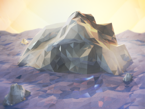
Looking for tutorials I found this low polygon model that covered a lot of basics from point manipulation to lighting and rendering. I felt this was a nice step into the program as it covered a lot of basics to create industry standard 3D models and it also came out with a nice result. I have actually admired this style for a long time too after seeing various artists replicate it on Dribbble.


iceberg_400x300

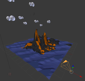
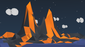
Using the tutorial I looked at creating a volcano in the sea. Originally I intended to animate this so I wanted a simple volcano and sea so I kept it simple and only had one point of interest. But this wass something I struggled with as I couldn’t figure out how to animate texture movement and is something I will have to look further into in the future. Instead I just did the volcano in full lava flow and manipulated the water by making it two shades of blue and using the same technique as with the mountain onto the sea but with smooth effects. This created nice waves and an image like the above. I felt it helped make the plain look less flat and gave it a character. I also added sub islands around so there was more in the background of the model. Overall I was very happy with the model and texturing part and found it pretty easy to do though I think my grasp of basic modelling principles helped with this. On the other hand though the modelling of the clouds took longer due to missing points when moving created shape distortion. This took a while to figure out as I was selected the movement as before but then I realised it was on a separate layer and I could press A to select all without selecting my plane.


ff6cba229d82a83e4ec4428bed66ef5a


I then set up the lights and camera playing around with the settings given. I found the camera position to be sensitive and it took me a while to get the angle I wanted. I also noticed the plain was too small in comparison to my volcano so I couldn’t get the full volcano in as I hoped without the edge of the plain showing on the camera. If I were to do this again I would modify this so that I could get a better end image. I modified things such as the sun’s volume, the stars and added a slight mist. I also added more point lights in to light up the lava to show it is lava and give it a further depth.


5097248829d52afd4d2d5d60e5c6b264


Looking at the final project and end result I quite enjoyed this, I however didn’t like using Blender and would look at using Lightwave or Maya as I previously have used these and feel for more intricate designs and professional models to use in games then these would be better programs. However if I was looking to create 2D art in a 3D program or simple animations then Blender would be the ideal platform to do this on. Overall though the image I created was something I was pleased with though it needs work in certain areas and paying more attention to lighting in order to further the fields of depth would be something I will look to do in the future. On the other hand though for my first attempt I am happy with the outcome and the ease in which I created the image though it took a while due to the learning of all the tools and shortcuts though I am comfortable that if I can do it again then I will do it quicker and it will have a better outcome following what I have learnt.

0

Portfolio Website Redevelopment – Planning

Image


Ever since I produced my original portfolio website I have looked to modify the page as I feel it wasn’t eyecatching enough. In order to fix this I looked at the background however with the multiple colours it was difficult to implement a design. I spent a while playing with designs that make the page looks clean but interesting enough to attract potential employers. While initially I was going to go with the one primary colour as suggested by my tutors upon revision I felt this looked quite standard. However as I am promoting myself and my creativity I want to push the boundaries as this will show that I produce unique designs with practicality as well as aesthetics.


d4578c110aac14db3edd4130306c5098


I believe what I created originally was a good base to start from. I was pleased with my initial design however as my tutors pointed out it was too central and could do with variation. This along with my background were my primary concern as I felt these were the first impressions of the site. Overall I am happy with the usability of the site and I just want to change the looks to make it more visually appealing.

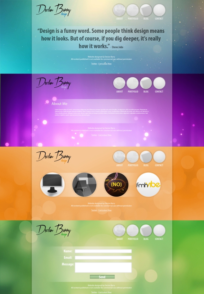
I started by looking at the positioning of the logo and the navigation. My aim with these were to make them less focused centrally in order to make the focus the content of that page. I also replaced the text on my website with my new logo. This was a significant improvement in my opinion as it made the page look more personal and less standard. I decided upon the placement of my logo in the top left as to ensure this is the first thing the user sees on the website so they know my name and can associate my work with it. I then decided to use my nav on the opposite side so that I can give more space to the content and the nav is the natural progression from the logo to view. As with my current navigation I have kept the logos but changed the shape to circles as this is a personal preference that I prefer over squares that gives character to the page. The navigation will be white with my images laid over them as per my previous design but the colours will appear on the hover over.


The colours relating to the section was something that I looked upon improving. I wasn’t very happy with how they were represented before as I believe the lack of gradients and depth made them feel unpolished. However I combined the background issue with this one to come up with the idea that each page would have a separate background relating to their colour. When I tried this out I found backgrounds had to be done exactly right not to clash with the text or make the text unreadable. This took a lot of trial and error in order to ensure that the background fitted my website perfectly and the ones I chosen did this.

However, with the lack of a navigation on the homepage I wanted to find something that represented me and my ideas. I looked at several different designer websites and a few had quotes or introductions that represented them. I liked the quote idea and this reminded me of a Steve Jobs quote “Design is a funny word. Some people think design means how it looks. But of course, if you dig deeper, it’s really how it works”. I feel this is a suitable quote that sums up my ideas about design well.


Overall I am very pleased with my designs. I feel it is a lot more eyecatching meaning there is a higher chance it will stand out amongst a sea of designers. I wanted it to incoperate my design ideologies and my personality instead of being standard and I feel my design now does this. As for the coding aspect it seems very achievable with my coding knowledge so I am happy with my level of design being realistic as well as in my opinion good looking.

0

FMHVibe Rebranding with Tom Hawkins – Summary

I have been working with Tom Hawkins about the FMHVibe Rebrand. I took a more managerial role in the development of this logo creation and I felt this was a great decision. Tom is a very talented artist and he managed to create exactly what I sent to the brief. Our communication was constant and always productive and I felt our design styles really complimented each other.


The project allowed me to collaborate with someone and establish a link that I can utilise in the future but also was a learning process as it meant I can make a brief for another person and see how coherent it is and find a style that can be productive as well as easily manageable. This is something I have never done before with another designer as they are often for me however giving someone feedback allowed and seeing them produce has bettered me as a designer in my opinion. Watching and influencing another person’s work flow has made me think about how I deal with projects and tips that could make me be more productive. I definitely enjoyed doing this project and taking a less hands on role and would like to do it again in the future as working with someone who is really talented and better my initial plans by getting a second view on them.


I will be working with Tom again soon as we look to continue this rebranding with an overarching brand for these potential websites. We will be looking at making the logo similar to the ones we have produced in this project yet with its own unique stylisation. I am hopeful this will be another successful project working with Tom in which ends with some great portfolio work for him and a very usable logo for FMHVibe.

0

Minecraft Skin Mesh


Image


Doing Game Development  at College really inspired me to look into how games are made. I did 3D modelling at College however this focused on the model rather than the texturing. I find texturing a beautiful art as it looks at all perspectives instead of just a certain angle. The flow and detail that has to go into a mesh in every pixels means that everything must go together and be worked on to the exact pixel. I picked Minecraft for this project as there are a lot of resources and guides available online in order to aid with this. Along with this it is open to everyone to modify their skin and can be updated instantly meaning I can get constant and fast visual representation of the outcome.

I based my skin off of me in a Batman shirt. I liked having shirt detailing as I felt this would offset the design nicely if I kept the rest basic. For my face I started with my eyes as I felt this was an appropriate starting base to work around and gather a reference on where the rest of my facial features will be placed. I used a Minecraft technique that is used on a lot of Minecraft skins when I researched into them. I then placed my mouth and made this a slightly darker shade than my skin. It is difficult to make any mouth shape given the limited pixels so I just went with a straight mouth. However the gap inbetween the mouth and eyes meant I couldn’t extend my beard shadow as I had wished to in order to add further details. For my hair I used three different colours of brown in order to give it detailing and depth instead of just being flat in which is what many Minecraft skins I have seen have. These in my opinion looked too flat and lacked dimension. For the legs I put a belt onto them to offset the colours and make my mesh have more interesting. I also added yellow laces on the shoes to again add colour into the mesh and break up the shades of black/grey.


Image

However, when testing this I noticed the belt needed to be on the body as the legs move independently meaning the belt will be distorted. With editing this to the top it meant this would be stopped. I then looked at other parts of my mesh and identified the colour of the jeans being too dark and a lighter grey would make the parts more distinguishable. Also with this I then edited the pockets to a more detailed and concise. I then edited my hair to make it further layered as I found this worked well but due to being so small it was hardly noticeable.

After this I decided I was happy with the skin and I felt I can now move forward with the design by making sections 3D as Minecraft allows a multi-layer mesh. Initially I did my hair and details such as the belt, shoelaces and pockets. The hair however didn’t look right as it left a gap and it looked more like a helmet than hair. On the other hand though the other items looked good like that and added a 3D element to the 2D mesh.


BjhDzdaCUAAWBP0


This project was very rewarding overall and was enjoyable. I loved creating the mesh as it allowed me to look at things in detail on a very limited surface and work objects together in a single plain as opposed to separate images like I am used to with UI design. I am going to look into doing more complex models in the future however Minecraft skins allowed me to use tutorials and previous meshes to get inspiration and work my way around the pixel art style and mesh creation.

0

FMHVibe Rebranding with Tom Hawkins

Image


I briefed Tom on the logo and showed him my previous logos. After that he came back to me with this idea. I liked the font and felt it was exactly what we were after as it is clean yet modern showing the cutting edge of the forum. I said to Tom I like this but expressed concern with the ball. I liked the idea but I was concerned about the intricity of the design as I feel if it is scaled down to a favicon it will lose its detailing and be a circle.

I also questioned the e merging into the icon as I feel it may not work with non-circular shapes. Tom then sent me this image the next day, we both mutually agreed this doesn’t work with the detailing and the design. Due to this communication got more and more it slowly evolved and changed into a more coherent design.

Image


We went back and forth on the designs and I suggested using a tie. I felt this represented the game well and the shape and design means even when small would be still easily recognisable due to the lack of small shapes needed. At this part I was very pleased with how the project was going and the developments Tom sent me and how we went backwards and forwards to further the project. I felt the communication we had was consistent and always productive so I was thrilled with this.


Image


During this development I sent Tom this mock up of a potential design. We both agreed that this was a good concept as the icon was recognisable and with his text and adding detail it can be very versatile but instantly recognisable to fans. He then went away and put his own spin on my design and came back with a design that were in my opinion spot on. He has made a design that fitted my brief and I feel the communication was key to this. He also showcased other games and how it can work for them, this was very impressive as he took the project to the next level to show that it checked all the boxes that I set initially.


Image


Overall Tom’s work was brilliant and our constant talking and me sending my ideas to him for development worked well. The logo fits all the needs and as seen in the picture above it can be modified in a number of ways while not losing the branding that will be key as it will be used across many mediums.

0

FMHVibe Rebranding with Tom Hawkins – Brief

As seen in a previous blog entry I redesigned FMHVibe.co.uk’s brand logo. While this was something I was initially happy with decision regarding the logo but as time went on the lack of vector image and when resized to small for a favicon or general design use it wasn’t very recognisable or readable making it hard for a user to identify the image. Also a few discussions with the team working there showed that they didn’t particularly like the way the h and the v merged. This looked ok with one colour but the two colours made it look strange as if the v was being put behind in which wasn’t the intention.

To solve this I decided to take on a more managerial role and work with Tom Hawkins on this and oversee the project using the base I already started with. Tom has significant experience in logo design for brands and with an impending expansion I felt this was a good opportunity to pass on my creative direction to another person in order to see the bigger difference. For me it will be a massive change from being the designer but one I am relishing as it allows me to set briefs and talk about work in a professional environment by analysing work and looking at modifications for the task.

0

Personal Brand Logo

I have been looking into creating a personal brand logo for my website and designs. With this I hope to learn Adobe Illustrator and the concepts of creating a personal logo that I can use throughout my work in medians such as from my work to Email signatures and more.


I feel this logo has to represent me personally and I am a big believer in creating simple but usable designs. I often tend to take a new spin on classic theories and concepts that currently exist and I feel my logo should incorporate this. Upon this I researched quite a few designers’ logos and one that really stuck in my mind was the signature-esque style some use. This isn’t as common as modernised text however I feel it is a classy approach to design and is a balance of the old and the new. I associate the signature on design work as a painters’ mark to show their work and I like this iconography as this suggests sophisticated work with thought and meaning to it.

Image

http://www.jackandmollycreative.com/product/text-only-pre-made-logo-design-simple-initial-signature

I then began crafting my own logo. I first looked on DaFont for free fonts and found a variety of suitable ones. This then came down to personal preference and I wanted a typeface that was clean to read as I understand that in an industry that is global not every person will have English as their first language. With this in mind I wanted my logo to be easily readable as a primary concern. This allowed me to then get down to one or two fonts. With this I then proceeded to ask feedback from people I know upon which font is best and after hearing this detailed response such as “The r on the Barry looks strange on this font” and “That’s nice as I like the shape of the D”.

After picking the font I looked at the design elements of the font and tweaked it with changes such as the D and B being larger. I felt this created a more unique design and made the logo flow better as it is then easy to distinguish between the words in my name and makes it feel further like a signature as in a signature letters aren’t always the same sizes. As well as my name I added on the word “design” to show what I do. This was the right choice in my opinion as it is then easy to distinguish what I am as opposed to clothes labels and hotels that also use this style for their logos.

Image

After this I looked at placement of the design and the colour. I wanted it not to be totally black and white but to remain in tact with the style I thought it would be a good choice to draw attention to the design element with it being a colour. This colour would then be changed depending on what it needs to be placed on and the theme of the medium.

Initially I looked at combining the D by making it the biggest element and having this be used for both my name and design (as seen above) however this lacked clarity and while trying to promote unity with it all I felt that the ‘design’ text looked out of place and unprofessional. I then continued to work on the placement of the design as I didn’t want it to overshadow my name but compliment it by making the logo stand out and thus drawing attention to the rest of the piece. With this I feel the cohesion of the B and the Y creates a nice gap for it to slot into. It also means if I wish to remove it for a watermark or other uses then this would be very possible.

Image

In my opinion this was the most suited place for the design text as it incorporated the natural gap already in the logo while being an element that adds to the design with a purpose. I was very happy with this choice and when trying it upon existing media such as my website and as a watermark on images it worked as imagined without stretching the image too much in width in which would make it difficult to use for such purposes.

Overall I feel this project has been long overdue and having some time has allowed me to complete this task. I feel my lack of Illustrator knowledge played a massive part at the start as I tried to overcomplicate logos however once I took a step back to do something simple as this logo is it allowed me to experience tools in a manner I found helpful. This project I feel has given me confidence to now step up to do something more on Illustrator in the future though I still prefer Photoshop for its User Interface. That being said I see the massive benefits of having Illustrator knowledge due to the production of Vectors is useful in all aspects of the industry but most importantly logo design. While I may not work too much in the program in the future I am very glad I have been able to produce something practical and exactly what I wanted in an unfamiliar program in which adds to my skill sets of programs that I have practice producing in. I feel this is essential early on in my design career as it allows me to experience what I like and don’t like using and doing.
0

Extended Photography

After the initial Photography project I wanted to look at what I had done and expand on this. I have enjoyed photography in the past so I looked upon my previous works in order to enhance in what I viewed was my weakest section – my editing. I identified two holiday photographs I had taken as suitable candidates to edit.

Image

Firstly I edited and cropped a photograph of a Turtle I took. With this image I used the rule of thirds in order to draw attention to it. With it being the primary subject I wanted to show this by placing it in a suitable position using the said rule of thirds option in which states that an object is more focused when it is on the lines.

For this image I looked at lighting too, The image was really blue so I looked at enhancing the turtle by making it lighter and adding a darker glow around it. I also wanted to simulate natural light in the top corner in order to split the background up and make the image appear more dimensional than it is.

After spending a lot of time tweaking this with brushes and techniques I feel I have achieved my aims to an acceptable standard. While it is still rough around the edges I am quite pleased with what I have managed to produce. If I were to edit it I would look more deeply into the turtle and perhaps add some different colours to it as I feel this would make it stand out more, however with this there would be a fine line between realistic and cartoony and I want to maintain the realism I feel I have achieved.

Image

After that I looked at a photograph of the Pyramids that I had taken. My aim for this piece was to brighten it up and play around with colours. The way I decided to this was by using brushes and layer styles on the sky. While I learnt several methods during this process through the use of tutorials and playing around I wasn’t really happy with the outcome. I feel the sky is too linear and could do with addition of clouds or more intricate details with the colours to set it off. Overall I am very disappointed with this piece as I feel some design details were clumsy and caused pixelation around the pyramids and the photograph wasn’t the best choice with the subjects spread out in my opinion. However this has been a learning curve and has allowed me to see the benefits of having a good photograph before editing and I am going to take this advice in the future making sure I get a good photograph before editing so I don’t waste my time.

Image

I continued to edit some photographs to improve my quality and then I decided to go and take some original photographs with what I have learnt. I decided to go to Bournemouth beach and play around with my iPhone 5’s panorama setting taking photographs of the pier, beach and beach huts. Following what I learnt from editing and as demonstrated above I decided to go with a much simpler editing style. While this necessarily didn’t work out for the pier I felt it worked very well for the beach huts. The mixture of colours combined with the very desaturated but not totally black and white image created an eye catching piece in my opinion. I felt not making everything else black and white but still drawing attention to the colours made the image feel very surreal. I played around with blurring once again but with before I felt I risked overkilling the image by doing this so I felt it as default and instead touched up the general quality of the photograph instead.

I am very happy with the outcome of this work and overall I feel I have made significant progress in learning about photography and editing. Though only a few of the images came out like I wanted the general point about how to take photographs and the editing of said images allowed me to progress past the initial project and learn some very important lessens on subject matter, over editing and colours.

0

Kinetic Typography – Summary

I really enjoyed the Kinetic Typography Project. While I wasn’t too thrilled with video editing as I have tried it a bit before and wasn’t that keen I really enjoyed the project and found it extremely rewarding. As an admirer of the works before I did this I have appreciated them even more since and I am really happy with my result. With this project working on timings I feel I have vastly improved and learnt many techniques on this such as following soundwaves to find the right sections to animate and I think with more practice I can get this perfect.

The project also aimed at teaching the basics of After Effects and I feel I ticked that box comfortably and I am very confident on the program now doing the basic controls and I wish to delve deeper into this. In fact now that this project has finished it has opened up including Video Editing shorts or game play videos for YouTube, doing more Kinetic Typography on other music I like or other types of media. I thoroughly enjoyed the After Effects project and now that this is over I am very eager to explore this more and see what I can come up with. It has made me appreciate video editing and like it more as while I was self taught I found it daunting but it has given me confidence to explore this area of media again.